Nuke’s Profile node offers a great way of monitoring your script and node performance – if you want, even by measuring in separate isolated areas.
We just need to pop in one (or multiple) profile node(s) and plug it right into the stream where we would like to receive our data from.
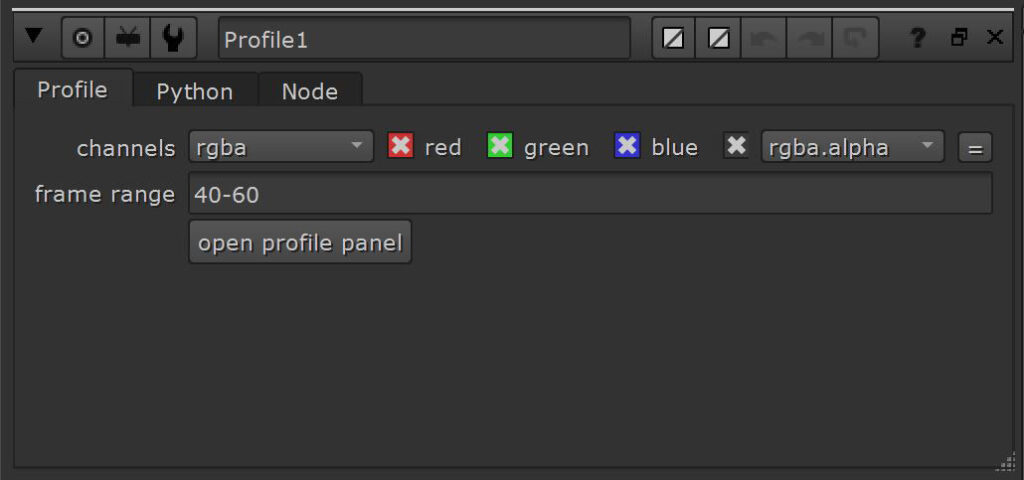
We can use frame ranges (1-10), groups of ranges (1-10, 20-30), ranges by every nth frame (1-100×10) as well as individual frames.
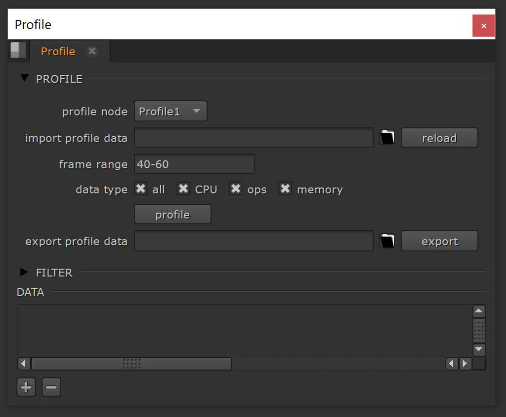
Now we just need to select the Profile node we would like to process and hit the profile button.
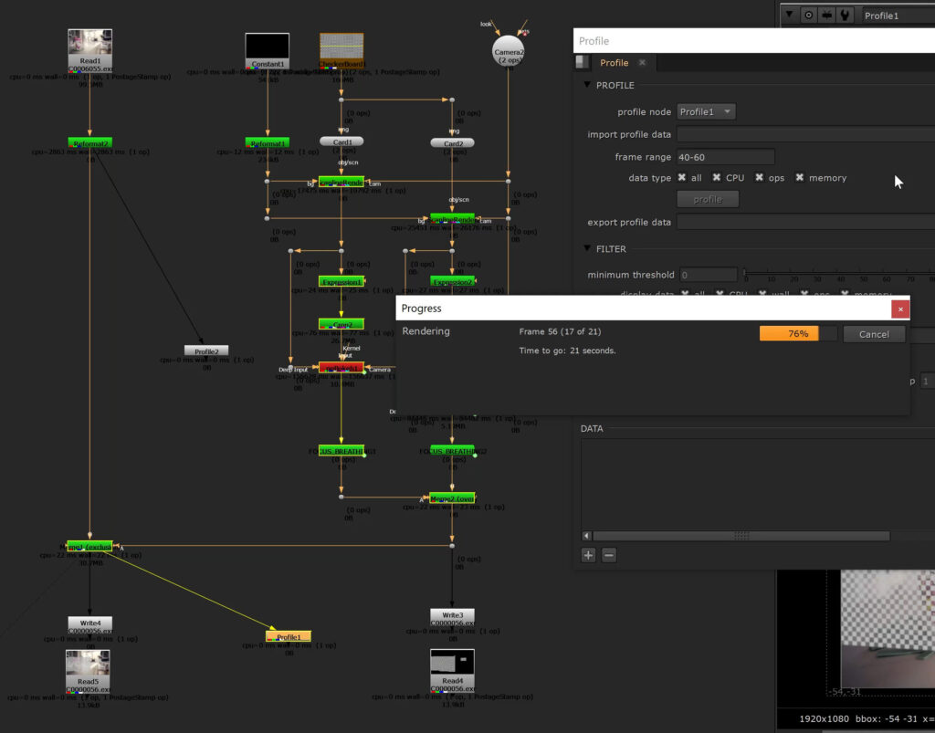
Time to grab a coffee – this can take as long as locally rendering your script.
There are 4 different data types which you can create profiles for:
- CPU – time in microseconds that your CPU spent executing the processing code (aggregated over all CPU threads)
- WALL – actual time in microseconds you have to wait for the processing to complete
- OPS – number of operators called in the node
- MEMORY – total amount of system memory used by the node
The most important one (WALL) is calculated regardless. You need to have at least one type enabled though – otherwise even the wall data will not be processed.
It doesn’t hurt to run them all. We will have a viewing filter option later on to hide unnecessary information.
After all the frames have been processed, we can see the first charts popping up.
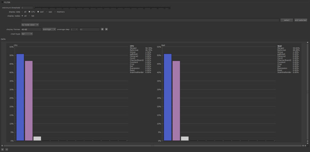
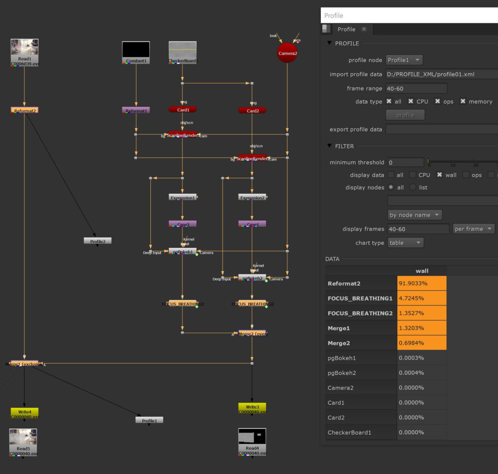
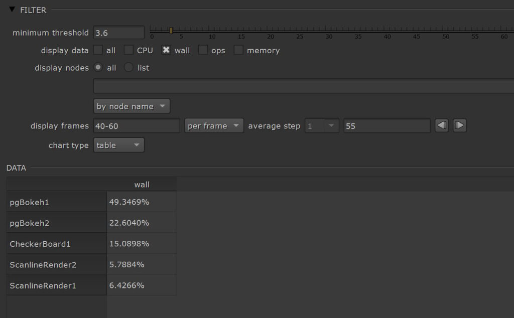
Nuke does a good job in converting all the measured times into percentages. You can choose if you want to see the results grouped by node class or individual nodes. That way you can judge if a specific node class is slow in general or if one specific node of that class is just acting up.
Please be aware that this interface only shows you the top 15 nodes. The rest is collected under other.
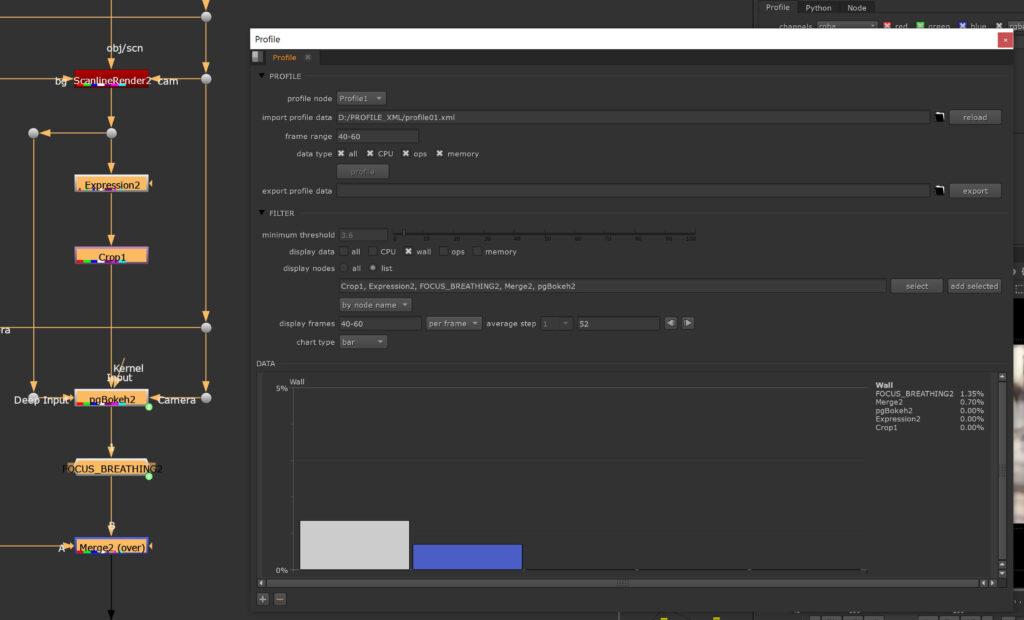
Also, you can switch the chart type to table and all of the nodes will be listed.
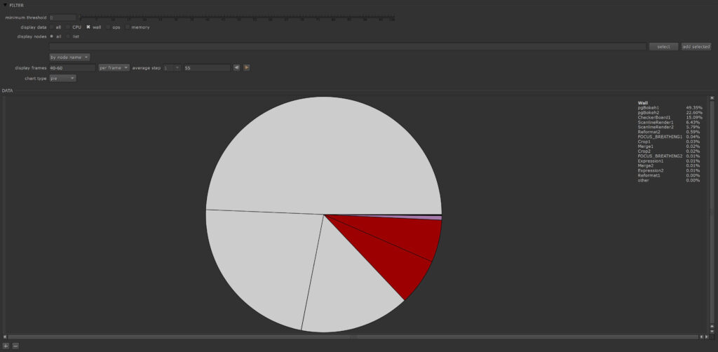
The pie chart gives us a different kind of view on how much every node contributes to 100% processing time, while timeline gives us the chance to judge the performance over the whole frame range.
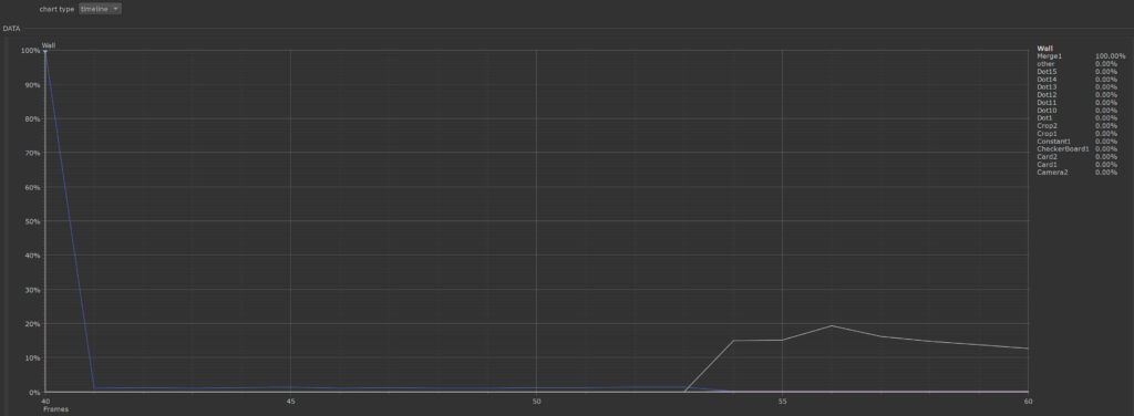
Talking about time. By default the other 3 charts show us an average value for the chosen frame range. We can switch it to frames though and click through them step by step.

Also to mention is the threshold filter. Here you can set a minimum percentage value, so nodes below a certain contribution will not show up in the charts.
If we now want to process another profile node, you have to be aware that your current stats will be gone and you will have to reprocess them. Luckily you can export the profile data into an xml file and reload it later.
Now comes the great part.
That way we can also import xml files previously created via Nuke’s performance timers.
Please check out Nuke Timeout episode 3 to see how you can write xml files during render time.
It is way more convenient to open those files here in the profile interface and you can see that you don’t have to be in the actual script the xml is referring to.
Let’s do a quick comparison between both approaches, performance timers and profile node and also think about how we can get the best out of both of them.
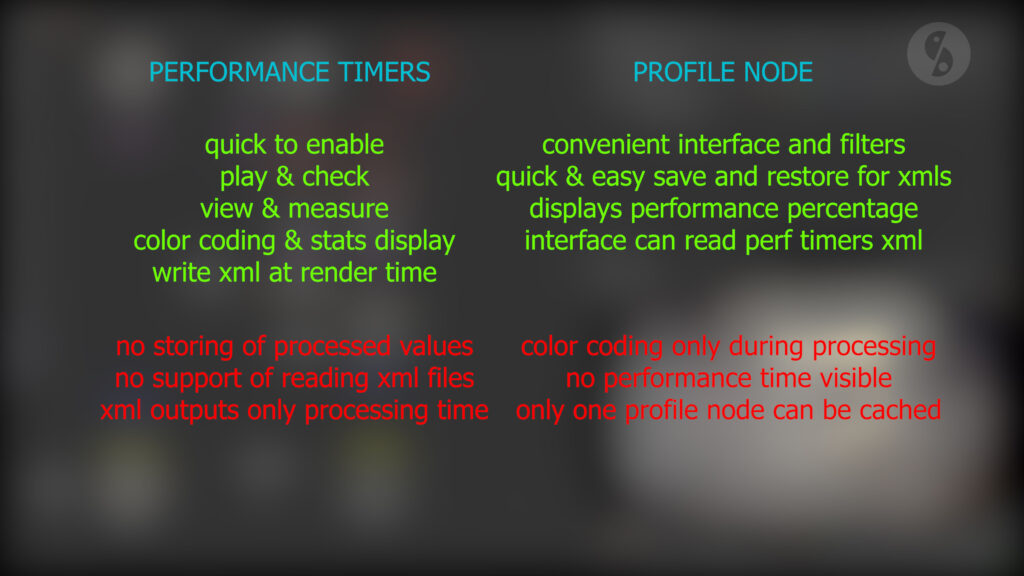
My conclusion and personal preference of use is the following:
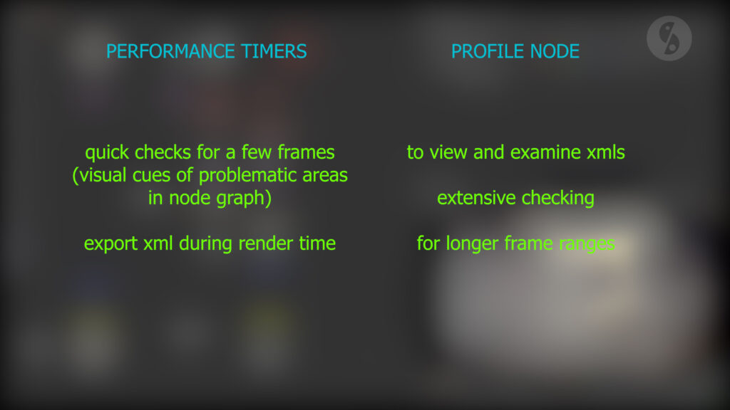
It’s great to have both options available.